


MaMaMesh
Mom Community
Visual Identity

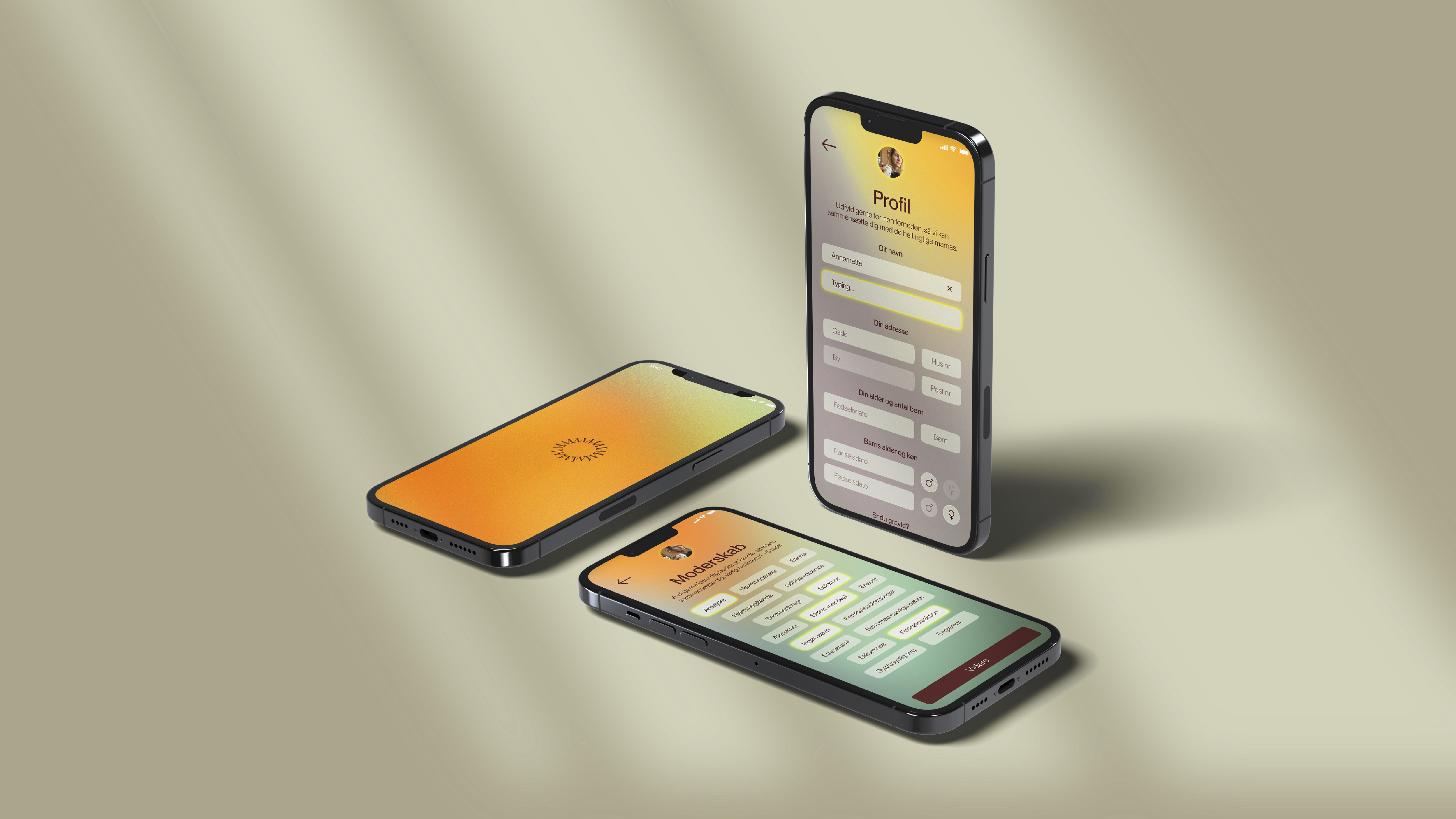
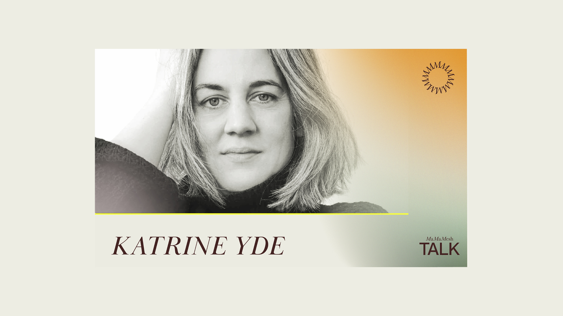
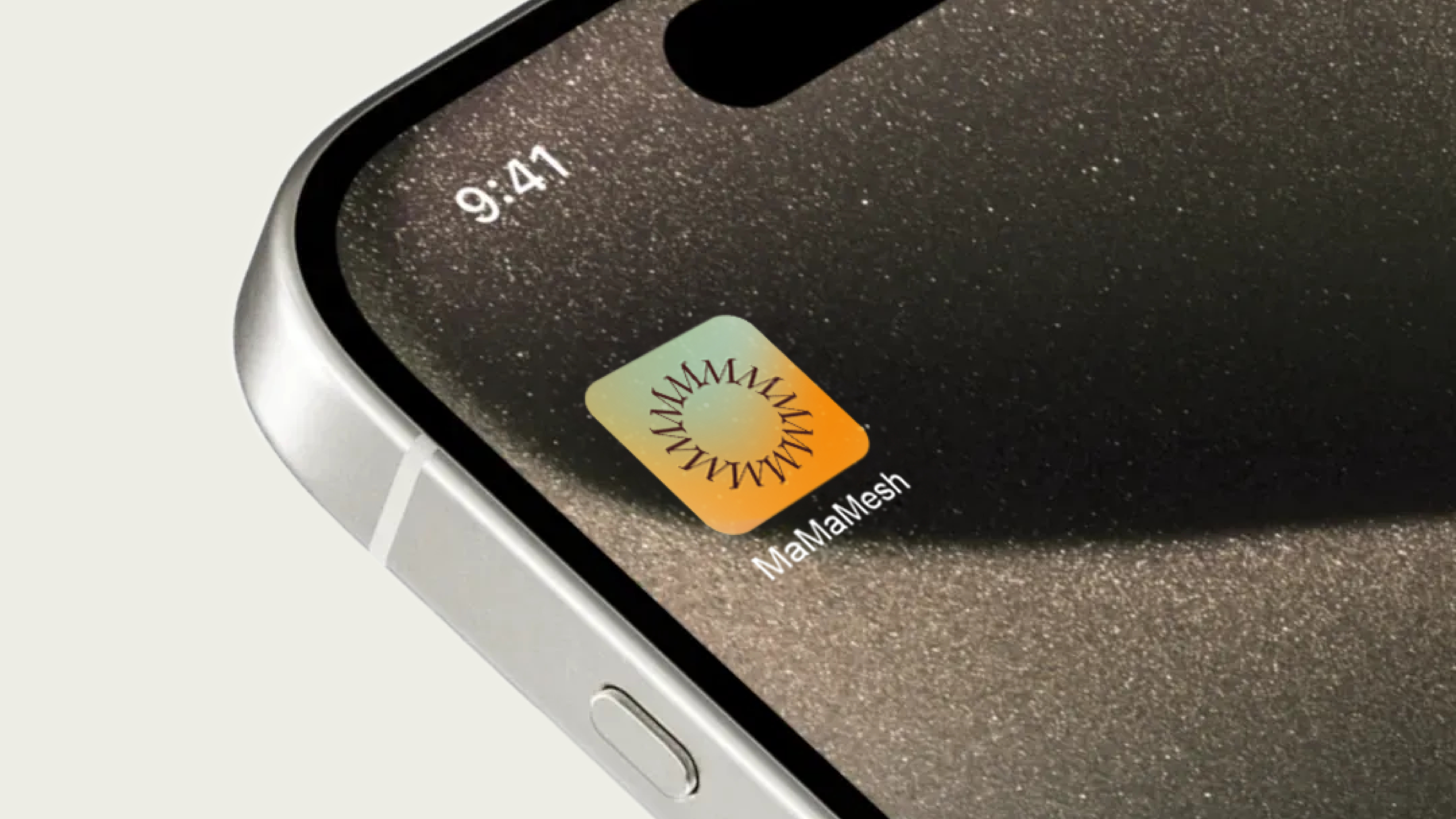
When Momunity rebranded as MaMaMesh, we created a visual identity that embraces both vulnerability and strength. It’s an app for moms on maternity leave – but also a social space for closeness, connection, and new energy.
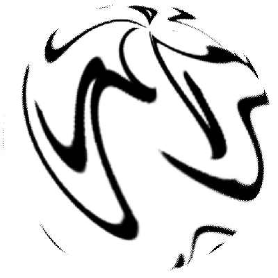
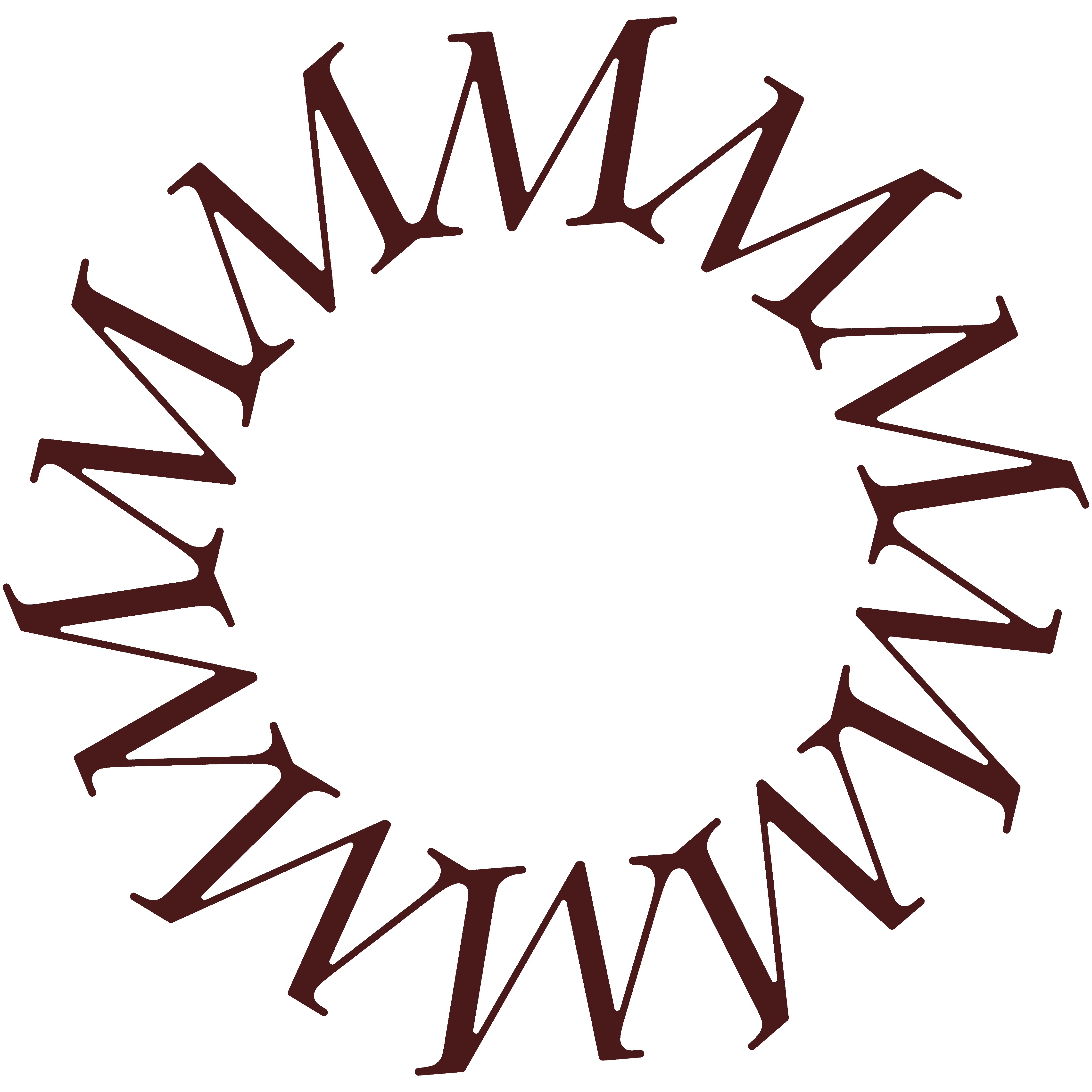
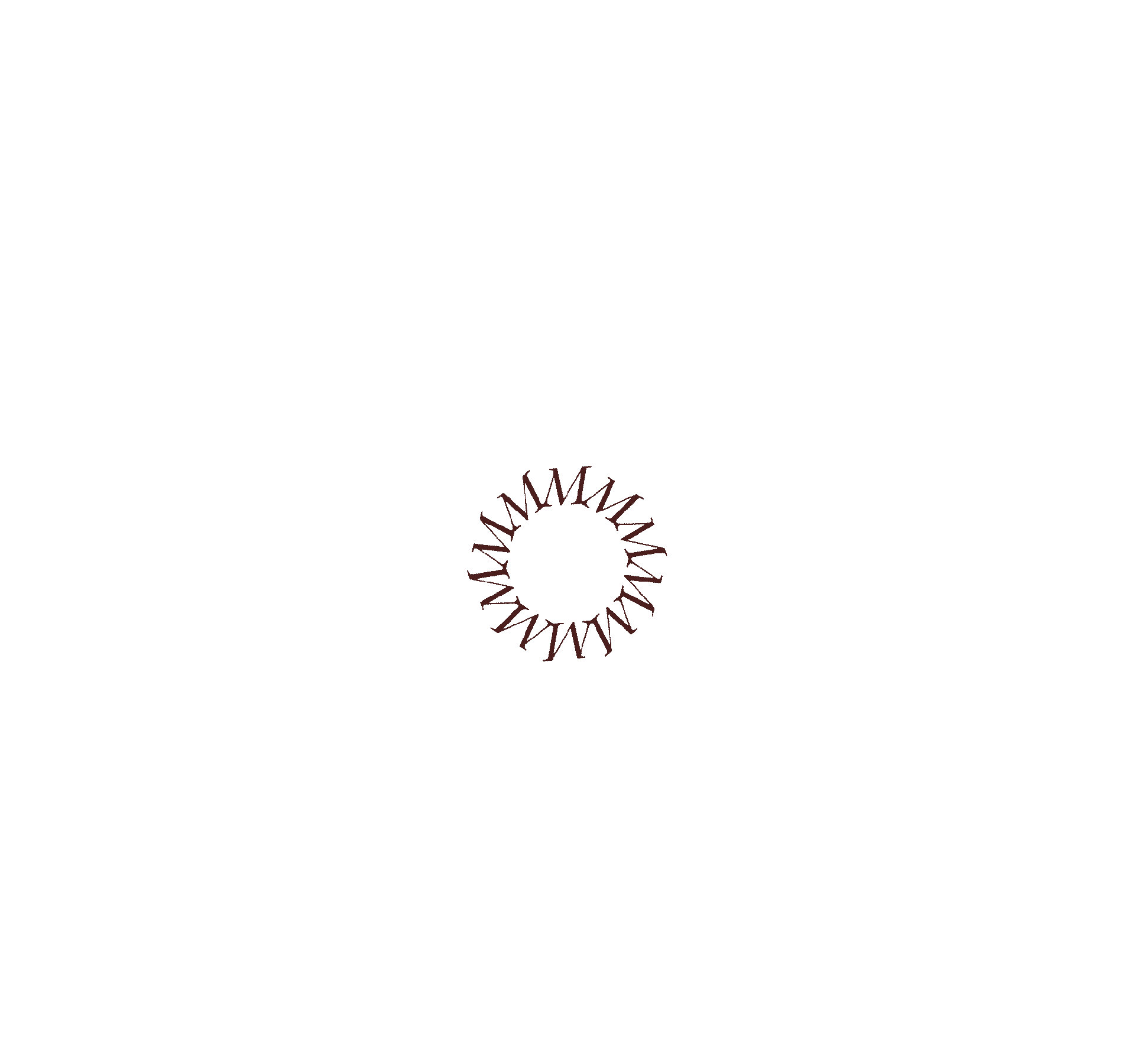
The logo consists of multiple M’s leaning on one another – forming a circle where mothers meet. The color palette is warm, soft, and uplifting. It expresses calm, sunlight, and space to breathe – exactly what maternity leave rarely is, but always needs.


WE DID
Visual Identity, Look & Feel, Motion Graphic
Visual Identity, Look & Feel, Motion Graphic

Store Kongensgade 68, 3.
1264 København K
+45 31 790 700
© 2025 BUTTER®. All rights reserved.